Report elements share some basic properties which we cover here. Properties and settings that are specific to an element type are covered in other articles.
The Element Types article discusses the high-level differences between the element types and has links to each of their specific articles.
The texts, settings, data and actions for a report element can be found together in the Properties pane.
Follow these steps to access the properties pane of a report element:
- Go to the ReportBuilder and edit your report.
- Click on the element you wish to customize in the element list or the view area.
- The Properties pane will slide out on the right side of the screen.
At the top of the properties pane, you will see the title or short name of the element and the element will have a blue border around it.
The available properties will differ depending on the selected element type. This article gives a brief overview of all properties. Depending on the selected element type, you will not see options that do not apply to it.
Hierarchy & Inheritance
A key concept to understand is the hierarchy of properties and how they are inherited from the level above but can be overridden at each level.
The order of inheritance is:
- Platform (default settings of CheckMarket)
↓ - Report
↓ - Element
If you want a certain setting for your entire report, then do not apply it to each individual element. Instead set it at the report level and all the elements in the report will inherit that setting. For example, if you want all your element titles to be centered and blue, set that in the Report Style and not in each element.
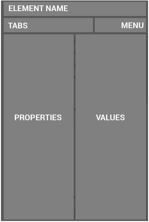
Properties pane
The basic layout of the properties pane is the same for all element types. The content changes depending on which element is selected.
At the top you see the title or short name of the element you are editing and an ‘X’ to close the properties pane.
Below that are some tabs that group properties together (covered in detail further down):
- Text: The strings and captions used in the element.
- Layouts: Predefined groups of settings for some element types.
- Settings: Individual settings that affect every aspect of an element.
- Data: The sources of data to be used by the element.
- Style: Change the appearance of your element, overriding the report level styles.
Each tab is divided into logical sections with the name of the property on the left and the value on the right.
Next to the tabs is a menu of actions that only affect the current element:
- Info: View information about this element such as type and ID.
- Embed: Get iframe code to place this element in your own website or intranet.
- Duplicate: Make a copy of this element.
- Delete element: Delete this element.
Text tab
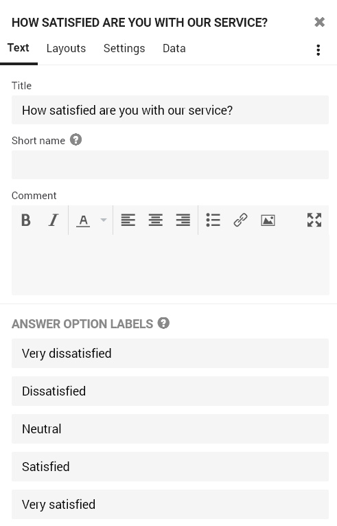
- Title: the heading that is visible at the top of the element. You can optionally hide it.
- Short name: by default, the title of an element is used in the element list (table of contents) on the left side of the report. If the title is quite long, it will get cut off in the list. In that case, enter a short name here and it will be used in the element list instead. The short name is also shown at the top of the properties pane.
- Comment: Optional text at the bottom of the element. The area provided to type is not large in the properties pane. Click on the
 expand button to get a larger work area. You will also see a lot more options on the toolbar, including tables and the Variables drop-down. You can also use our scripting language to add calculations or show different texts depending on values in this and other elements. Often used to provide conclusions and insights about the element data. It may also include conditional feedback and instructions on how to improve the score of the element.
 - Answer Option Labels: relabel the answer options used in this element so that they are short, concise and clear. When you give two or more options the same label, the results for these answer options will be merged. Changes here do not affect the survey itself.
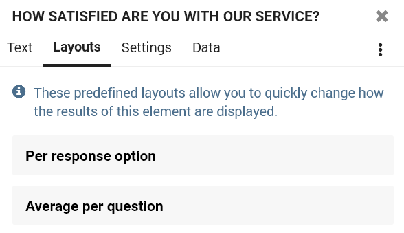
Layouts tab
Select one of the available predefined layouts to quickly change how the results of this element are displayed without having to go into the settings yourself.
To further customize the element layout, use the options in the Settings tab.
Settings tab
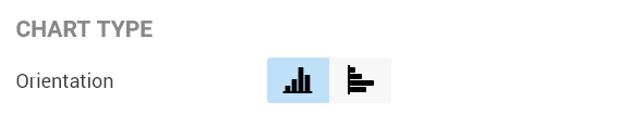
- Orientation: For the Column & Bar element type, you can switch between a bar chart view and a column chart view. Additionally you can stack the responses so that they are shown in one single bar or column.
- Rotate: Change the position of the first slice of a pie chart, usually this is the first answer option.
Check this option to show the additional options for adding a fixed benchmark to the element.
- Value: set a fixed benchmark value.
- Label: add a name for the benchmark, e.g. “results previous year”, “company average”, “goal”, etc.
- Chart type: you can add this benchmark as a line to the chart or as a separate bar/column.
- Use as base value: Make all bars/columns start from this value instead of 0.
If you want to add a dynamic benchmark, then switch to the Data tab and add a benchmark data source.
- Label axis: show or hide the text on the axis that holds the items of the chart.
- Value axis: show or hide the numbers on the value axis.
- Data labels: hide or show the value, the percentage or both directly in the chart.
- Total: Show or hide the total of a column when they are stacked.
Show more information when moving your mouse over the chart.
- Data labels: select whether the data labels should show the number of respondents, the percentage compared to the total or both.
- Include question: show the question text when hovering over the chart or not.
- Include answer option: show the answer option label when hovering over the chart or not.
Show or hide different statistics from the chart, such as the number of respondents, average, median, standard deviation, etc.
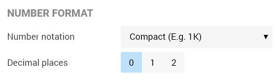
- Number notation: select a compact notation (e.g. 1K, 2M, …) or the full notation (e.g. 1000, 2 000 000, …) for each number.
- Decimal places: choose the number of decimals you wish to show for each number.
Data tab
The Data tab contains the sources of data that the element is based on. This can be questions, contact metadata or respondent metadata. In the data tab you can add a breakout, a benchmark or an extra data source. Additionally you can set filters for each data source separately.
- Add a breakout: This means taking the responses to the main data source and splitting them out by another data source. For instance, take a satisfaction score and break it out by gender or age categories, department etc.
- Add a benchmark: instead of setting a fixed benchmark in the Settings tab, you can also add a dynamic benchmark based on another question or based on contact or respondent metadata. The benchmark data source will ignore any other filters, including the report and share filter.
- Add an extra data source: combine data from multiple questions or from questions and contact or respondent metadata. This can be done to group questions with the same scale.
Style tab
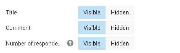
- Title: show or hide the element title by selecting Visible or Hidden. This way you can, for example, use a title to find your element back more easily, yet only show the chart itself in the report.
- Comment: show or hide the element comment by selecting Visible or Hidden. This way you can, for example, show the element title to report viewers, and use the Comment field for internal information that is not shown in the report itself.
- # of respondents (N): Show or hide the total number of responses (N) for each element, by selecting Visible or Hidden.
- Width: Set the element width in percent. This lets you place multiple elements next to each other.
- Accentuate value: select this option for Gauge elements to make the slice of the scale that indicates the value shown slightly larger.
Select the desired color palette that is to be used in this chart: the default chart colors, a color palette where every bar or column receives a different color, a color gradient, positive and negative colors, or select your own custom colors.
If you wish to set the colors for the entire report, use the Style settings for the report instead, by clicking on the cogwheel at the top right and selecting ‘Style’.
Change the font, size and alignment for the different parts of this specific element.
Tip: if you wish to apply a different font, size or alignment for the entire report, use the Global Style Settings for the report instead, by clicking on the cogwheel at the top right and selecting ‘Style’.
Check this box if you wish to override the element style settings of the report for this element. If you wish to apply this style to the entire report, use the Style settings for the report instead, by clicking on the cogwheel at the top right and selecting ‘Style’.
When would you use this? Well, for instance to create header elements that have no background color themselves and seem to sit right on the report background. To accomplish this, click on the background color and set the transparency to zero. Then do the same for the border color transparency.
If you apply a theme or make changes at the report level and an element does not seem to be affected, it means that the element has a custom style. Just deselect the box next to ‘Custom element style’ and the element will start respecting the report level style settings again.
Leave a Reply