Once you have finished tagging the open responses (verbatims), it is time to start analyzing. What you have done till now was basically turn unstructured data into structured information. Now it’s time to try and find some insights.
The results of the tagging are now available in three places:
- In the ReportBuilder
- On the open responses page
- In the raw data downloads (Excel, SPSS)
You can read about each of these places below.
Tags in the ReportBuilder
- Go to the survey.
- Click on Analyze.
- Click on Reports.
- Click on the report where you would like to add charts.
- Click on Add Element.
- Click on the arrow next to Questions.
- Click on the open question with tags.
- Click on Text-analysis tags.
On the right side in the properties pane, you can set up the chart you need.
You can add multiple elements for the same question. For instance to show a top 5 and a bottom 5 of tags.
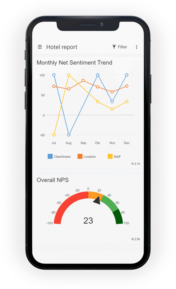
You can also plot the Net Sentiment Score (NSS) on a timeline, which consolidates a huge amount of information into an easy to read chart!
Tags in Open Responses overview
To reach the Open Responses page for a question, follow these steps:
- Go to the survey.
- Click on Analyze.
- Click on Text Analysis.
- Click on the question.
- On the top right, click on View Report.
On the page that opens you will again see a response cloud with right underneath it a table listing all of the responses. Click on the Tags tab to see the tags chart.
In the top right corner of this chart you will see some addition chart options. Attention: not all of the options will be available when you have not added sentiments to your tags.
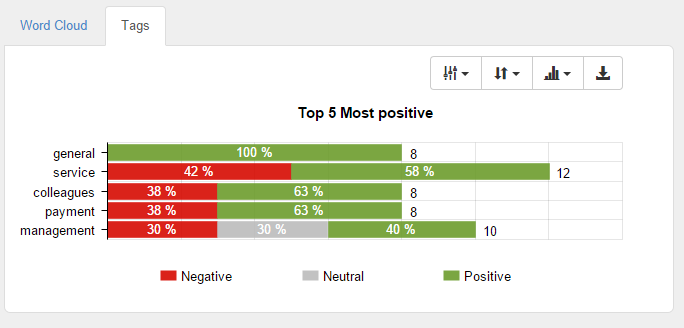
- Limit data in the chart: select to show all of the tags or limit them to the top 5, top 10 or top 20 of tags, sorted by the selection in the next button.
- Sort by: sort the tags by most positive, most negative or simply most used.
- Chart type: the following chart types are available:
- Clustered: each tag is split up in 3 bars, one bar per sentiment.
- Stacked: there’s 1 bar for each tag, and each bar is stacked per sentiment. The longer the bar the more that tag was used. Totals are mentioned next to the bars.
- 100% stacked: each bar has the same length, no matter how often that specific tag was used. Using this chart you can quickly see whether a specific tag was more positive, negative or neutral compared to the others. The actual totals for each tag are mentioned next to the bars.
- Download: download the chart as an image.
Tags in raw data
The tags and sentiments you apply to open questions are automatically added to the raw data downloads, both in Excel and in SPSS. A column is added for each tag after the question in which it was used. The value that appears in the column depends on whether or not sentiment analysis was used. If sentiment analysis was used, the word ‘positive’, ‘neutral’ or ‘negative’ will be shown in the tag column for each response that was given that tag. If sentiment analysis was not used, a ‘1’ will appear in each cell instead. This allows you to manipulate the data in Excel or SPSS for further analysis.
Leave a Reply