Tooltips, popovers and modal windows are great for clarifying certain words or showing additional information in context without having too much text or taking up too much screen space at once.
You can use tooltips, popovers and modal windows in surveys and ReportBuilder elements. They CANNOT be used in emails.
Which one to use?
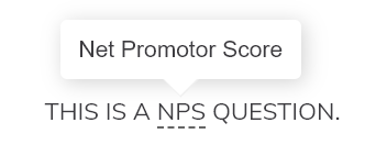
- Tooltip: use tooltips to show a short text to respondents when they hover over a word or icon.
- Popover: use popovers to show a longer text, or when you want to have a link to an external web page. It is shown when the respondent clicks on a word or icon. The window remains visible until they click again outside of the popover.
- Modal window: use modal windows to display a long text, images and links. This creates an overlay that covers a large part of the screen. The background becomes darker so that the focus lies on the window. Respondents click on the X in the top-right corner or outside of the modal window to close it.
Syntax
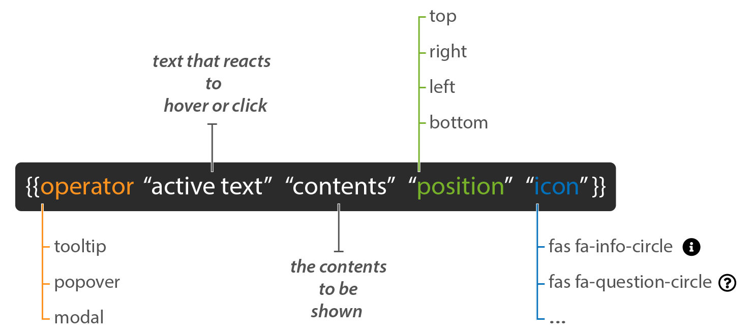
You can create all three elements by adding some CSL to your text using the following syntax.
- Operator: determine what you want to use: a tooltip, a popover or a modal window.
- Active text: this is the text that reacts to either the hover or click. Leave the space between the double quotes empty when you only want to display an icon.
- Contents: this is the content that will be shown in the tooltip, popover or modal window.
- Position (optional): use a position to determine where the contents must be shown (only for tooltips and popovers).
- Icon (optional): show an icon as trigger instead of text.
How to add?
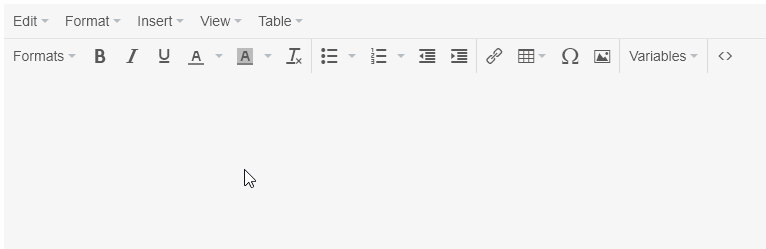
1. Use the drop-down menu
Insert a tooltip, popover or modal window using the Variables drop-down menu in the editor:
- Place the cursor where you want the element to appear.
- Click the Variables button.
- Select Tooltip, Popover or Modal window from the drop-down menu.
Note: All items in the drop-down menu are ordered alphabetically, so the order may differ from this animation.
2. Type the CSL yourself
- Start the CSL code with two curly brackets {{
- Type the operator (tooltip, popover or modal).
- Type your active text between double quotes that will trigger the element.
e.g. “click here“. - Add a space.
- Type the contents between double quotes.
- Optionally add a position.
- Optionally add an icon class.
- Close the CSL code with two curly brackets }}.
Examples:
{{tooltip "more info" "I am a tooltip." position="top"}}{{tooltip "" "I am a tooltip triggered by an icon" position="top" icon="fas fa-info-circle"}}{{popover "click here" "content" position="right" icon="fas fa-star"}}{{#modal "click here"}}You can add more text here. Quotes, new lines and extra variables are all possible.{{/modal}}Use an icon as trigger
To trigger your tooltip, popover or modal window using an icon, add an extra parameter as shown in the syntax above.
Add the Font Awesome class to show the icon you want.
The code below will show an info circle. Note that the ‘active text’ is now empty. This way only the icon will be shown.
{{operator "" "contents" icon="fas fa-info-circle"}}The code below will some text and an info circle icon right next to it.
{{operator "active text" "contents" icon="fas fa-question-circle"}}Use dynamic content
Here is a very handy tip: if the content you want to show in your modal window is long or has lots of formatting or images, place the contents in a hidden text/media element instead of trying to type it directly into the CSL code. Then show the contents in your modal window by using a variable.
Follow these steps to add dynamic content to a modal window:
- Add a Text/media question to your survey and hide it.
- Type the text there that you wish to show in the modal window.
- Go to the Settings tab and add a data label.
In the example below we used ‘text1′. - Click on Save.
- Now you can show this text in a modal window on any other survey page, or even in a ReportBuilder element by referencing the Text/media question’s data label using a variable. Like this:
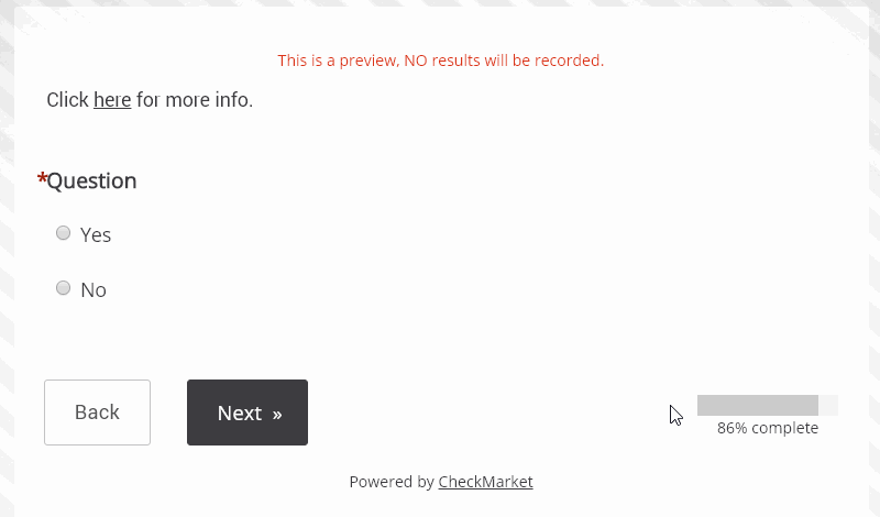
Click {{modal "here" survey.questions.text1}} for more information.
This method, will keep your CSL code tidy and make translating a lot easier!
There’s also another way of using longer text inside modal windows, tooltips and popovers.
You can use the block syntax. Here’s a few examples:
{{#modal "Click here"}}
This text can be longer and contain markup, quotes and variables.
{{/modal}}
{{#tooltip "Click here"}}
This text can be longer and contain markup, quotes and variables.
{{/tooltip}}{{#popover "Click here" position="right" icon="far fa-star"}}
This text can be longer and contain markup, quotes and variables.
{{/popover}}
Leave a Reply