A crosstab is used to combine the results of different questions and/or operational data of your survey in a structured way, and allows you to perform statistical tests to identify significant differences. While you can use a breakout to show values of different subsets of respondents next to each other, such as NPS score by department. Is the difference between the groups, statistically significant? Well, a crosstab will tell you…
When to choose for a crosstab?
Of course you can already learn a lot by analyzing your survey results question by question separately. But the real fun begins when you start combining different questions and search for relationships between them.
One way to do this, is by applying breakouts to your charts. Breakouts allow you to compare results for different subgroups of your population side by side for the same question, in a visually attractive manner.
Crosstabs on the other hand give a more numerical representation of the results and include some advanced statistical possibilities. So if you want to investigate your data (and the relationship between them) thoroughly and look for statistically significant differences, crosstabs are the way to go!
Crosstab example
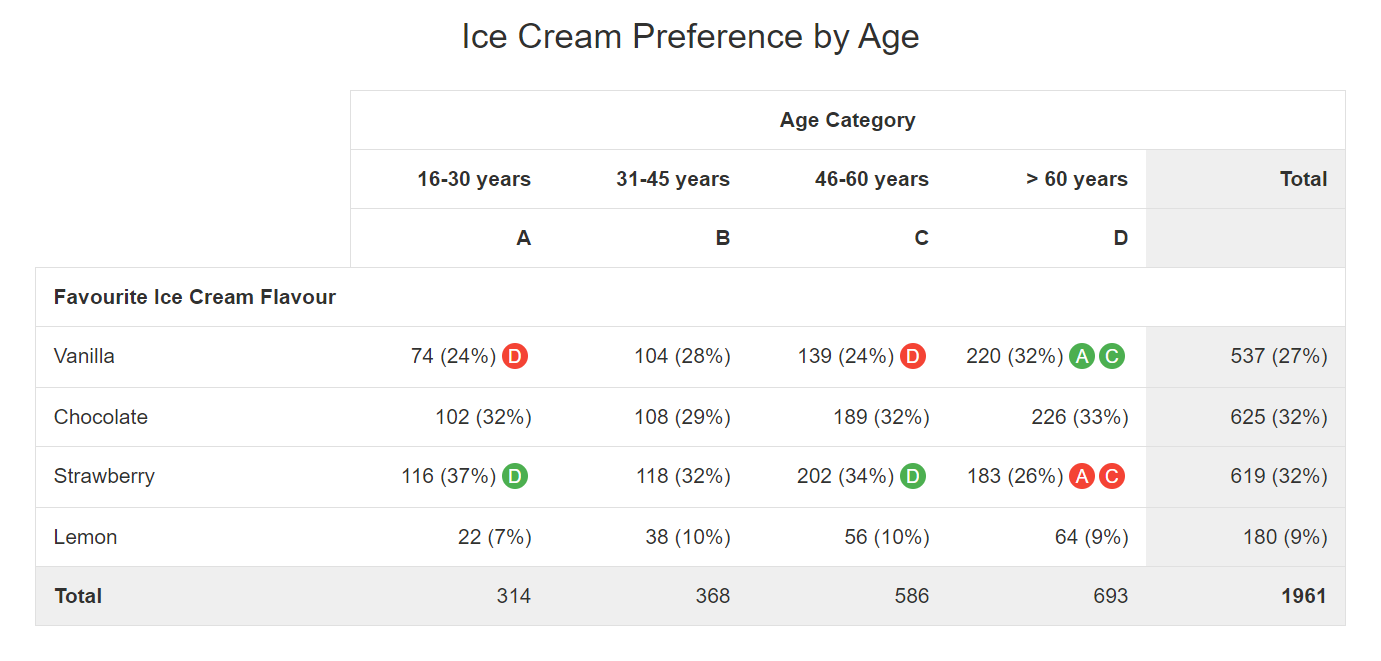
In the example above we compare the preferred ice cream flavour for 4 different age groups. The data shown are the number of respondents that have selected each of the 4 flavours per age category. Row and column totals are included, and we have added column percentages per age group and for the total.
In the total column we can see that it is a close call between chocolate and strawberry flavour for the top preference (both preferred by 32% of the respondents). These 2 are closely followed by vanilla taste (27%). Lemon lovers are a minority (9%).
To check whether there are any differences between age groups, we have performed a Z-test on these data (with 95% reliability). The table reveals that the 60+ groups has a statistically significant higher preference for vanilla (32%) compared to the 16-30 and 46-60 age groups (24%). Strawberry on the other hand is more favoured in these last 2 age groups, with again a statistically significant difference vs. the oldest respondent group.
By using the green and red indicators referring to the column headers, the key learning points of this table are immediately visible without any effort. You don’t have to be a statistical expert as our ReportBuilder does all the work for you.
Other statistics
Besides the Z-test to detect significant differences, some other interesting statistics are available for crosstabs.
One of them is the Pearson’s Chi-squared test. This is a so-called ‘goodness of fit’ test. Simply put the test tells you whether the observed results in your crosstab differ a lot from the results you would expect when your variables are independent (in our example when every age group has an identical taste preference). If the calculated Chi-square value is higher than the ‘critical’ Chi-square value you can state that the ‘null hypothesis’ of independent variables can be rejected and this for a specific ‘p-value‘ (probability of rejecting the null hypothesis whilst this is true, often 0,05 is taken for this). In human language this is a strong indication of the existence of actual differences between your subgroups.
We also offer Fisher’s exact test which is familiar with the Chi-square test but can only be applied in specific situations, i.e. when you have a 2×2 table of categorical variables with small cell sizes (expected values less than 5). For larger cell sized the ‘standard’ Chi-square test is recommended.
Also Kendall’s tau-b can be calculated, which is a non-parametric measure of association between columns of ranked data (e.g. ranking of students for 2 different exams). The result is a rank correlation coëfficiënt returning a value of -1 to +1, where 0 is no relationship, +1 a perfect positive relationship (‘concordant‘ pairs > all students are ranked exactly the same for the 2 exams) and -1 a perfect negative relationship (‘discordant‘ pairs > ranking for the 2 exams is completely inverse) .
More detailed info on these tests can be found in every statistical handbook.
Be careful…
Be careful when interpreting the results of statistical tests. These tests are all based on a specific set of assumptions and when these are not met your results have no value. Sample sizes must be large enough (e.g. > 30 for each subgroup in a Z-test), the distribution of your data has to meet certain criteria (e.g. normal distribution for a Z-test), data points can be dependent or independent from each other, etc.
So before starting your statistical ‘hocus pocus’ be sure that you understand what you are doing. Consult a statistical handbook or specialized site to find out more about the background of these tests and underlying assumptions. This will help you in the selection of test(s) to use and in the correct interpretation of the outcome. If you don’t fully understand the basics of a test it is better to leave this to others.
Add a crosstab to your report
Follow these steps to add a crosstab to your survey report:
- Go to the survey.
- Click on Analyze.
- Click on Reports.
- Edit an existing report or create a new report.
- In the report, select the element after which you would like the new element to appear. Otherwise it will be added to the end of the report.
- Click on Add element.
- Select the Element type tab.
- Select Crosstab.
- Select your column data (groups/segments you want to compare).
- Select your row data (one of your survey questions).
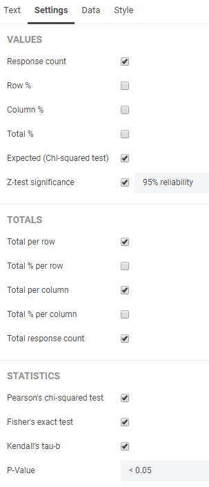
The element will appear. Under the Settings tab in the Properties pane you can determine how exactly you want to show the data and which statistical tests you want to apply.
Under the Data tab you can change or switch your column and/or row data. Your crosstab is not limited to 2 variables, you can add additional ones if you want.
Leave a Reply