An element is the basic building block of a report or dashboard.
The two most important properties of an element are:
- Element type: Determines how the data will be visualized.
- Data source: Provides the data that is used in the element, such as results of one or more questions or it may be metadata that was passed to the survey.
This article goes into detail about the element types available in the report builder when you add an element. Once an element has been created, its type cannot be changed.
The purpose of a report or dashboard is to convey information and more than that, to provide insights into the survey results. Matching the correct element type to the correct data is crucial in achieving those goals.
You can create multiple elements for the same data source, this is useful to present and see data from different sides. For instance, for a satisfaction score, you may want to show an average per department and show the average score over time in a timeline.
After you have created an element, many aspects of the visualization can be modified. For instance, if you create a bar chart element, you can choose to show vertical bars, horizontal bars, stacked bars, etc.
Here are the basic element types:
| Type | Description | |
|---|---|---|
 | Text & Media | Add free text images, videos, … to the report. Use it for instructions, conclusions, sub-titles, etc. You can also place variables in the text. Read more. |
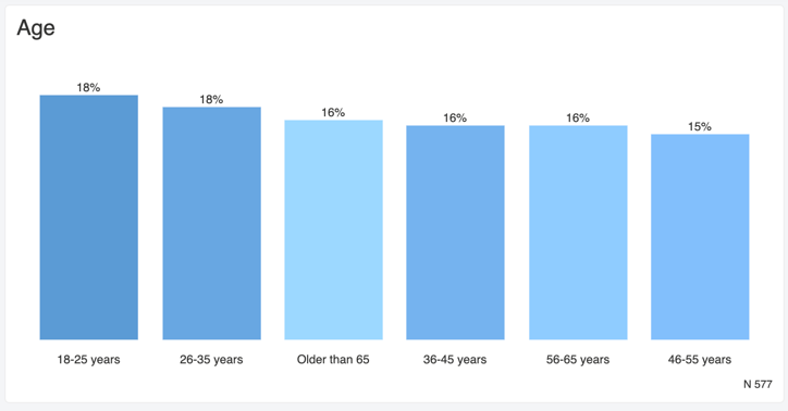
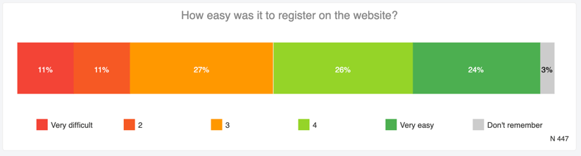
 | Column & Bar | This flexible element will render a column chart or bar chart. You can select a horizontal or vertical layout, stacking, breakdowns by answer option or aggregates like average and NPS. |
 | Line chart | Use this to view information as a series of data points. |
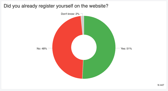
 | Pie & Donut | Create a circular-shaped chart that you can represent either as a pie, or as a donut. Best used to show the proportions between a limited number of options. |
| Timeline | Track an aggregate value over time, such as the average satisfaction, NPS, respondent count, etc. grouped by a selected period (day, month, quarter, year). If you want to limit the dates covered, use a filter. Read more. |
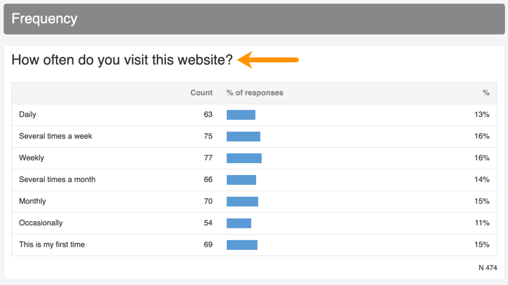
 | Frequency table | Show data in a compact tabular form, without a chart. |
 | Scorecard | Show one number (e.g. count, average, NPS, etc.) in a large font. You can easily put different scorecards next to each other to create a dashboard. It is different from the gauge in that the scorecard does not put the number on a scale. |
 | Circle | Use this when you want to display one aggregate number on a scale in a simple graphic (average, median, NPS count, etc). Works well for dashboards. |
 | Gauge | Use this when you want to display one aggregate number on a scale in a simple graphic. |
 | List | Use this to show a list of respondents or contacts. You can choose the columns you want to show. |
 | Text responses | Show the actual answers provided to open questions. Paging is automatically applied so that the element does not get too tall. You can set the number of items to be shown per page. |
 | Wordcloud | Display the most frequently occurring words in answers given to an open question. The more often a word was mentioned, the larger it appears. |
 | Text analysis tags | Display a chart of all tags that were added during the text analysis. |
 | Map | Use this to show response times and aggregates on a map. |
 | Radar | Use this to show a spider chart with axes arranged radially. |
 | Key driver quadrant | Use this to view correlations between important questions in your survey and one or more potential drivers. |
 | Cross tab | Look for a correlation between multiple questions and/or metadata. When you select this element type, you will be asked to select two different data sources next. The result is a table that crosses both data sources. If there is a correlation between two sets, those cells will be highlighted. You can filter the element (or entire report) further in order to only cross-tabulate responses of people who completely filled out the survey, people who have a certain answer pattern, who answered during a specific time-frame etc. |
 | Dropouts | Use this to see respondents and dropouts per page. |
| MaxDiff summary | Use this to see the relative importance or relative preference of attributes. |
| Conjoint summary | Use this to see the relative attribute importance and utility value of each attribute combination. |
Examples
The following shows some examples of report element types.
Text & Media
Column & Bar
Pie & Donut
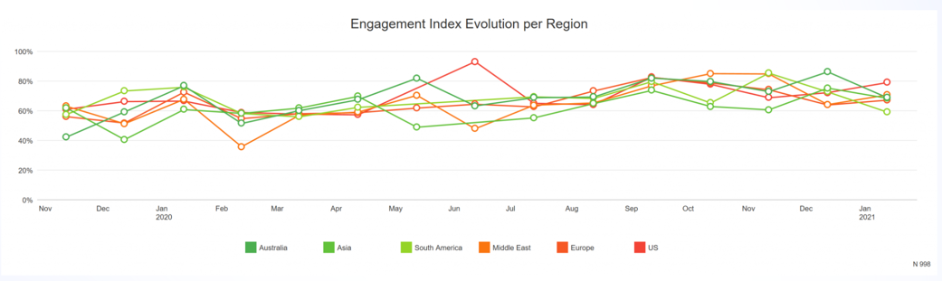
Timeline
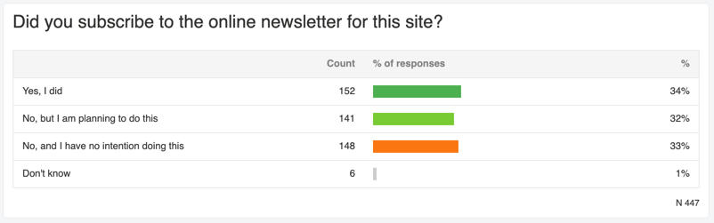
Frequency table
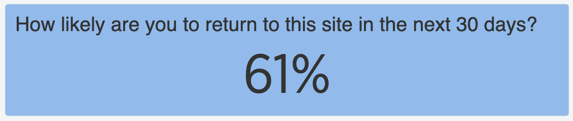
Scorecard
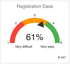
Gauge
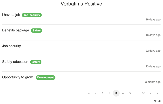
Text responses
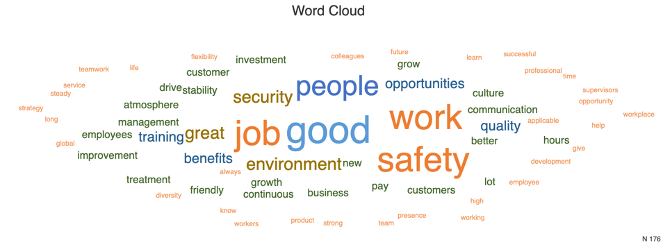
Wordcloud
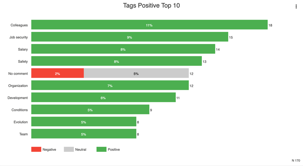
Text analysis tags
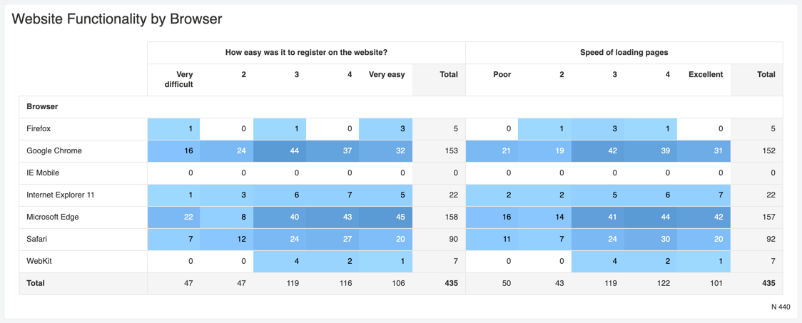
Cross tab
Leave a Reply